

in our third article covering artwork from the video nasty era, i’m taking a look at slasher films. click images for larger versions. for background info and more covers, check out our previous entries.
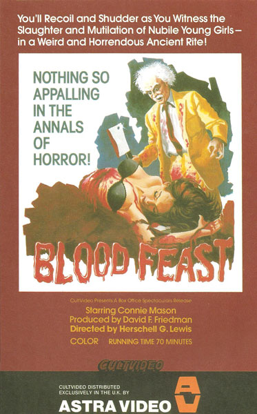
historically important but otherwise laughable, this herschell gordon lewis gore classic centers around an insane egyptian attempting to build the perfect woman out of parts attached to girls who are still using them. i’ve seen better covers for this film, but this one has the bravery to ask “what would happen if einstein went on a killing spree in a yellow suit?”

most of these covers use a barrage of small images and inane taglines in a desperate, frantic attempt to attract your attention. this cover goes the opposite route, using just one image and the film’s title… i like it. apparently this is an ultra low-budget spanish giallo featuring lots of disco. as horrible as that sounds, i’ve got to see this movie based on the cover alone.
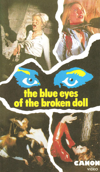
with a name like the blue eyes of the broken doll, you just know its going to be scary. also known as the house of psychotic women and the house of doom, likely due to distributors thinking the “blue eyes” title just didn’t convey the proper sense of fear. i can’t really tell what’s going on in the bottom two photos, but the top two make this look like it might be a half-decent horror film. also — the yellow eyebrows are freaking me out.
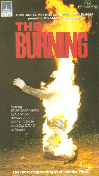
hey! we actually reviewed this film here and here. i much prefer the covers featuring cropsy holding the shears above his head, but as is true of most of the video nasties, this cover is horribly literal. following the what-you-see-is-what-you-get philosophy, this cover presupposes that anyone interested in something called the burning wants to be absolutely sure that they will actually get to see a guy on fire.
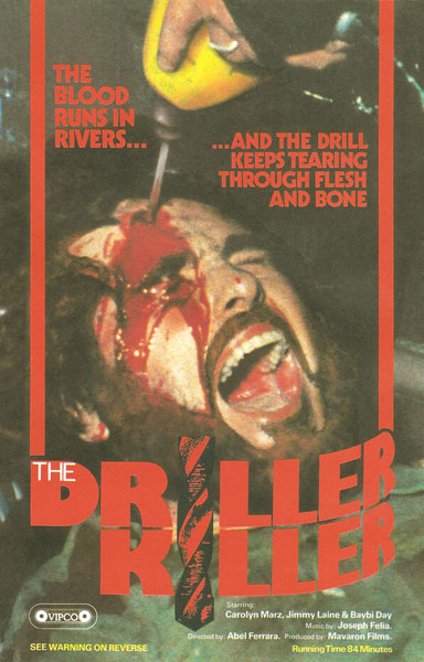
oh! i’m glad they decided to go with such subtle cover art. i don’t have photo of the box’s back, but i’m fairly sure the warning mentioned (bottom left corner) will say “warning: holy crap! front cover has a picture of a guy with a freakin’ drill going into his forehead!”
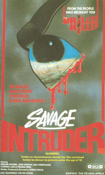
i don’t see any of the same names here, so i’m not sure who the “people” are mentioned in the top blurb. its certainly the same cover designer as the driller killer, so perhaps that’s what they meant. the same red/white/yellow color scheme, the same red text borders… the same odd mention of traversing through “flesh and bone.” unfortunately this isn’t as successful of a cover as i have no idea what it’s supposed to represent. i think that’s an axe, but what’s that reflected in it? a kalamata olive resting on a sea anemone?
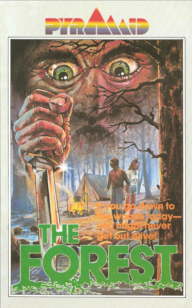
this one really reminds me of a “choose your own adventure” book from when i was a kid. the tagline (in the near illegible orange) even kind of sounds like the first page of one… “if you go down to the woods today — you might never get out alive! if you want to go down to the woods today, turn to page 113. otherwise turn to page 39…”
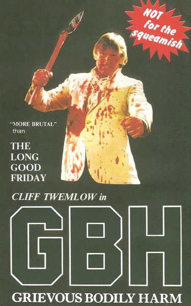
cliff twemlow wrote, starred in and composed the music for this shot on video crime drama. i’ve included it here because while it may not be a slasher film, it certainly looks like one based on the cover art alone. i’m particularly fond of the ‘not for the squeamish’ call-out, the odd use of caps and quotes around “MORE BRUTAL,” and the fact that the quote “more brutal than the long good friday” is attributed to no one in particular.
why indeed.
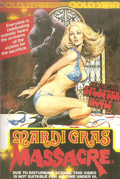
a little on the busy side, this cover leaves no room for misconceptions. in case the title and image left you wondering if this was an american splatter movie, it lets you know right in the corner there. i’m not sure what the x is doing after the title (unless that’s the rating) and what i really want is that guy to take his razor and carve a little semi-colon up there after ‘celebrating’ in the tagline.
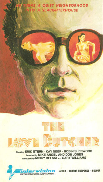
that is a fantastic title font. and i’m not sure this neighborhood would qualify as ‘quiet’ given the reflections in his glasses… looks like it’s a pretty happening place before he converts it to a slaughterhouse. the only other noteworthy thing here is that i’m glad intervision specifies that the video entertainment they supply is recorded before-hand and not actually recorded as you watched it.
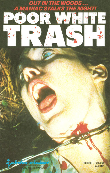
great exploitation movie title… but do you think it refers to the killer or the victims? or both? and do you really think the financial status of either relate to the plot?
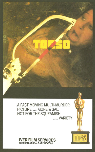
i’ve always wanted to see torso, but have yet to run across a copy of it. i’ve heard it’s a classic and far better than this cover would lead you to believe. the top half seems straight-forward enough, but what’s with the bottom half and that quote? those are like super-ellipses and parts of just make no sense. “gore and gal?” and are they really trying to attribute that nonsensical quote to variety?
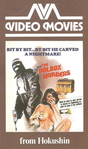
i own this mean-spirited exploitation slasher, and it’s pretty much what you’d expect given this cover. the cover isn’t bad except maybe the narcissistic-ally sized “from hokushin” and the clumsily phrased tagline which appears to include an extra “by bit.”
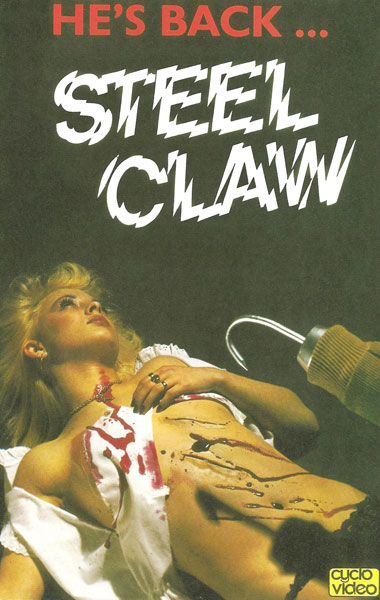
this is my favorite cover of the batch, for a number of reasons. i love the bloodless claw and the clean, corduroy jacket pulled up over it… i love that the girl appears to have been wearing a table cloth… but most of all i love the simple tagline, “he’s back…” it implies that we should be familiar with the steel claw and shocked at his return… yet this doesn’t appear to be a sequel. there’s something sort of odd and charming about a film attempting to look like a sequel to cash in on a non-existent successful predecessor. or, perhaps the title of this film is actually he’s back… steel claw… a strange title for certain, but no weirder than quantum of solace.

this actually arrived on dvd recently is waiting patiently in my netflix queue for me to get to it. the cover would lead me to believe someone goes car to car at a drive-in and kills everyone with a pirate sword, which doesn’t sound like an easy feat to pull off, so i’m looking forward to it. this one outdoes the driller killer in that not only does it have a ‘see warning on reverse’ notice… it also has a warning on the front. i’m certain on the back it says ‘see warning on reverse’ and also has the same warning printed here, so you could actually get caught for hours in the video store turning the box over and over, caught in a crappy b-movie möbius strip. in BASIC this would translate to:
10 PRINT “SEE WARNING ON FRONT”
20 PRINT “SEE WARNING ON BACK”
30 GOTO 10
One Response to Video Nasties – Slasher Edition
Pingback: Drive-In Massacre (1977) | MONDO EXPLOITO
Subscribe Without Commenting